What Are Upper Air Maps and How Are They Used?
The location of troughs and ridges can play an essential role in a region’s weather. Weather observations above the ground are collected by weather balloons. Data from one a single site are plotted on a sounding, but an upper air chart can show information from multiple observation sites.
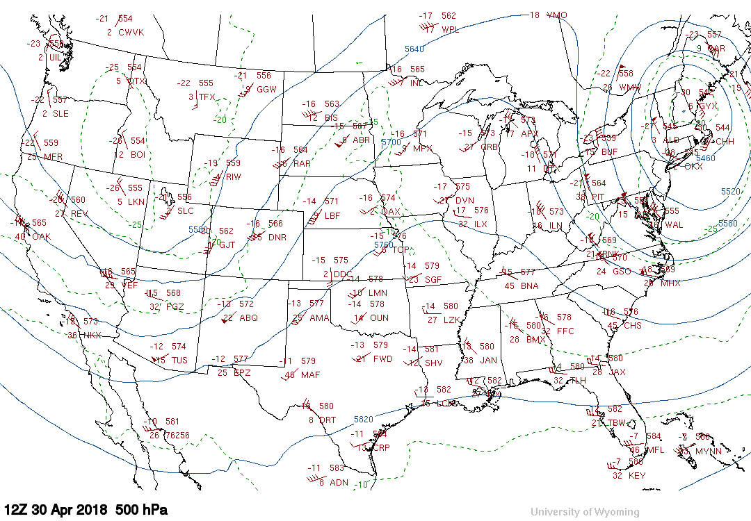
Most upper air charts are plotted in pressure coordinates instead of height coordinates. The primary reason is that many meteorological concepts are more easily explained when using pressure. Using pressure coordinates shows the height of a pressure level, for example, 500 mb, above the observation stations. The height of a particular pressure level will typically be lower in colder environments and higher in warmer ones. When the upper atmosphere is observed, there are specific pressure levels that are always reported. These levels are called mandatory pressure levels and are the surface, 850 mb, 700 mb, 500 mb, and 300 mb or 200 mb. Below is a look at a sample 500 mb chart.

500 mb/ 500 Hectopascal Chart Monday, April 30, 2018- 7 am CDT
Generally, there is rising motion to the east of a trough, which could lead to the development of precipitation and thunderstorms if moisture and instability are present. To the west of a trough, sinking motion is usually observed.
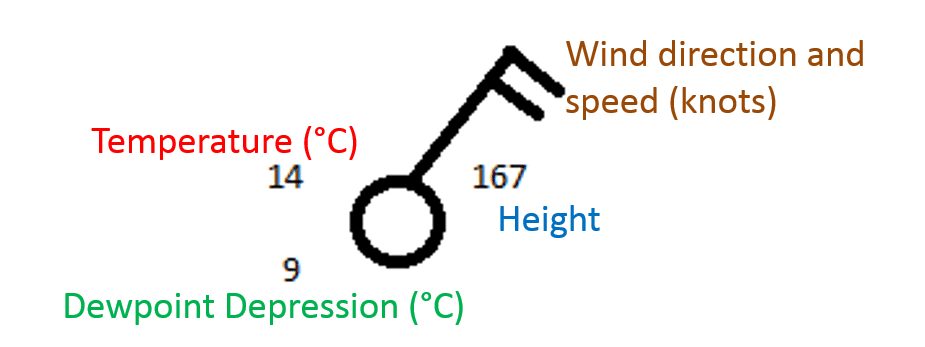
The data plotted at a point on the map is called a station plot and is similar to one that you might see on a surface map. However, there are a few differences between the station plot for a surface and an upper air map. Upper air maps report temperatures in Celsius. The number in the lower left is usually dewpoint depression, which is the difference between the temperature and the dewpoint. The height of the pressure surface is plotted in the top right of the station plot. Below is an example of how a station plot may look on an upper air map.

Upper Air Map Station Plot
Depending on which pressure level you’re looking at, there are different rules for interpreting the height of a station plot. These rules are summarized below.
- 850 mb: Add 1000 to the value in the height field. Example: A value of 419 becomes a height of 1419 meters.
- 700 mb: The leading number is either a 2 or 3, whichever brings the value closest to 3000. Example: 914 is 2,914 meters; 032 is 3,032 meters.
- 500 mb: Add a zero to the end. Example: 548 becomes 5480 meters.
- 300 mb & 200 mb: Add a 1 to the front and a 0 to the end Example: 065 is 10,650 meters
The two other features are the solid grey contours and the red dashed lines. The grey lines are height contours; similar to isobars on a surface map; height contours connect points of equal height. The red dashed lines are isotherms or lines of constant temperature. For pressure surfaces above 500 mb, you will sometimes see lines of constant wind speed, or isotachs plotted.
While data on upper air maps are the same regardless of the pressure level, each level is typically used to learn something specific about the atmosphere. For instance, the 850 mb level can be used to identify the low level jet, as well as fronts that may be difficult to pick out on a surface map. At 700 mb, moisture content can be inferred; low dew point depressions at 700 mb suggest the presence of very deep moisture from the surface to the 700 mb level. The 500 mb level is usually considered to be the middle of the atmosphere approximately. At this level, the trough and ridge patterns tend to become more evident. Lastly, the 300 mb and 200 mb levels are the jet stream levels and can give you a good idea of where the jet stream is located. In the warm seasons, the jet stream is closer to 200 mb whereas, in the cold season, it is closer to the 300 mb level.
Soundings and upper air charts are both essential tools for understanding the structure of the atmosphere above the ground. While soundings provide data for the upper levels over a relatively small area, upper-level charts can give you a bigger picture of what’s going on in the atmosphere. This broader scope can help you identify systems that could aid in the development of precipitation and storms. Upper air charts play a vital role in understanding atmospheric structure.


 Comprehensive weather insights help safeguard your operations and drive confident decisions to make everyday mining operations as safe and efficient as possible.
 Learn how to optimize operations with credible weather and environmental intelligence. From aviation safety to environmental compliance, our comprehensive suite of solutions delivers real-time insights, advanced forecasting, and precise monitoring capabilities.

