The Changing Colors of Fall
by Daphne Thompson, on Oct 11, 2017 2:12:01 PM
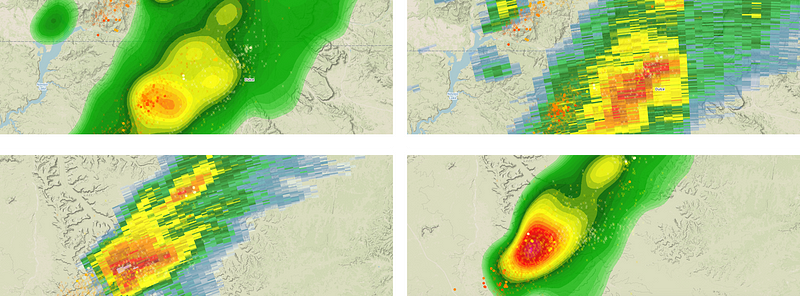
Let’s play a game. See if you can spot all the lightning strikes.

How did you do?
We have assumed that our customers have incredible vision ever since we launched real-time lightning within WeatherOps Display. Two of the most used products within our mapping application (radar and lightning) play well together, and that’s a terrible thing!
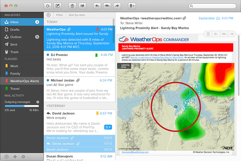
Let’s say a lightning alert pops up in your inbox.

That link in the text of the lightning alert will take you to the WeatherOps display to provide more context of the situation. Similarities between the color tables of the radar and lightning are creating confusion and (eventually) frustration with the map. Most people I have talked to will toggle between the two products. We put you in this BAD situation.

I’m sorry.
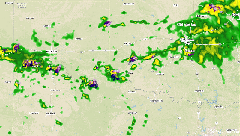
So, we have been iterating through many versions of a lightning color table that can satisfy the needs of our customers. Using Chroma.js, we were finally able to settle on a palette that contrasted very well with the radar color table and differentiated between old and new strikes without much thought.

Introducing contrasting colors to the radar provides a stark difference and a way to identify strikes much easier.
This feature will be rolling out very soon. If you would like a preview of the display, just let us know, and we will get you set up with a staging account. We hope you like it and in the future, we will make sure you don’t need 20/10 vision when building the next feature in WeatherOps display!


